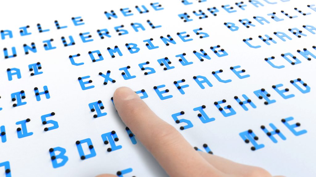
For many fully sighted people, Braille has always been a mystery. Since it doesn’t really have any resemblance to the English alphabet, Braille, for them, is a completely foreign language. Also, typically Braille signs are created separately and displayed under or above text in print graphics. The separate signage make a clear differentiation between what is to be read by sighted people and what by those who are blind. However, that same differentiation also doesn’t prompt or encourage fully sighted people to learn Braille. Moreover, Braille signage is not implemented everywhere because in many cases it is rarely considered by sighted people. To encourage sighted people to learn Braille, and to merge the two forms of signage, Kosuke Takahashi, a Japanese designer, has created a new typeface called Braille Neue.
Braille Neue’s typeface consists of existing characters in English and Japanese with Braille characters imposed on top. The result is a new set of characters that are easily readable by sighted people with Braille bumps superimposed on top that can be felt and read by blind people as well. This ingenious method of merging two mediums not only serves the purpose of encouraging sighted people to learn Braille but also ensure that one signage works for both audience, instead of creating separate Braille text and displaying it under or above the text.
Using this method, it is also possible to overwrite existing signage by placing Braille bumps on characters and making them accessible for blind people. Placing Braille bumps on existing letters is easy, which helps make our current environment inclusive as well. Kosuke plans to use this universal typeface (Braille Neue Standard for English and Braille Neue Outline for Japanese) at the Tokyo Olympics and Paralympics 2020 to create a universal space where information is completely accessible.
Read the source link and visit Kosuke’s website for more information on Braille Neue.
Source: Fast Co Design
Website: Kosuke Takahashi
Image Gallery:

