
All the common typefaces used these days have always been a problem for people with dyslexia because even though there are not many alphabets in the English language, quite many of them look similar, thus making reading difficult for dyslexic people. To make reading easier, Christian Boer of Studio Studio has created a new font called Dyslexie that makes changes to the structure of alphabets, punctuation etc., so that alphabets don’t look similar, thus making reading easier and less confusing for dyslexic readers.
I contacted Christian Boer to get more information about Dyslexia, and this is what I found out..
first of all, Dyslexia is not free. Currently, Christian is selling this font only in The Netherlands but soon plans to sell this font in other regions. It looks like he wants to sell to bigger groups (like schools, other organizations that focus on Dyslexia) instead of individuals to keep costs low (although his youtube page suggests that he wants to sell to individual users as well).
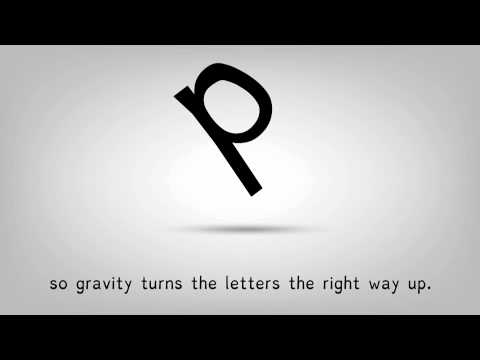
Watch the video to know more about Dyslexia, and how it would help Dyslexic readers.
You can contact Christian Boer here.