Readability Made Easy In Firefox

After the add on is installed, the user would see a little blue icon that looks like the letter “R”. Left clicking the button activates Readability. The design elements of the page vanish, and the text shrinks in to one column. Right clicking on the “R” icon at the bottom right corner of the screen brings up a menu that allows the user to change the style, font size, and margin.
Here is an example.
The screen shot below is that of a Wikipedia page without Readability activated. This is how we all see this screen on our computer screens (click image to enlarge).
The text on this page looks extremely cluttered, and it may not be very easy for someone with low vision to read the entire article without getting frustrated. This is where Readability comes to their rescue!
Clicking on the “R” icon at the bottom makes the page look like this (click image to enlarge):

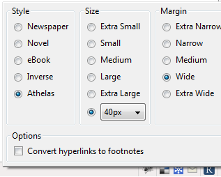
Notice that the only thing left on this page is the main text from the article, which is displayed in one column. The menu at the bottom lets the user choose the style, font size and margin. The screen shot above is the “newspaper” mode. The text can be enlarged up to 40px. The margins can be set from “Extra Narrow” to “Extra Wide”, although I noticed that only “Wide” and “Extra Wide” really worked. Here is the menu (notice the “R” icon at the bottom):
(click image to enlarge)


eBook (click image to enlarge):

Inverse (click image to enlarge):

Aphelas (click image to enlarge):

In order to switch to “normal mode”, the user has to click on the “Arrow” icon on the top left corner (click image to enlarge):

This menu can also be used to print the document, and email it to others.
One thing to note though is that this add on works only on pages that have a single article. I tried to use it on a page that had results of a Google search, and I got this error (click image to enlarge):

I tried it on the main page of CNN’s website too, and got a similar message (click image to enlarge).

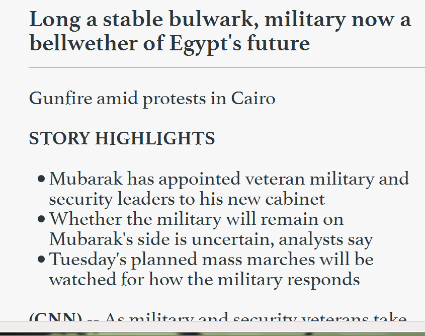
I tried to proceed by clicking the link, but got the same error that I got for the Google search page. However, it worked great when I clicked on a headline and visited the main article (click image to enlarge).

One thing I should mention is that this page manages to keep images associated with the article, but gets rid of videos.
All in all, Readability is a great add on, and people with low vision can take advantage of it to read text on websites sans the clutter, and unwanted elements.
Visit Readability to read more about it, and to learn keyboard shortcuts!
Update: A fellow group member on LinkedIn had this to say about Readability:
Source: Yahoo Accessibility Blog
Leave a comment